
Chevrolet Logo History: 110 Years of Design Evolution
“`html
Chevrolet Logo: A Century of Design Evolution and Brand Identity
The Chevrolet logo is one of the most recognizable automotive symbols in the world. Over the past 110 years, the emblem has transformed from a simple design to a sophisticated mark that represents American automotive excellence. This evolution reflects broader changes in design philosophy, corporate identity, and consumer culture.
The Birth of the Bowtie: 1913 Origins and Design Intent
Chevrolet’s iconic bowtie emblem traces its origins to 1913, when company co-founder William C. Durant reportedly sketched the design on a napkin during a trip to Paris. The simple cross shape, resembling a necktie bow, was registered as a trademark the following year. While Durant claimed the design was inspired by wallpaper he saw in a French hotel, some historians suggest it may have been influenced by the Chevrolet family coat of arms.
The original 1914 logo featured a gold bowtie on a blue background, creating a striking contrast that made it instantly memorable. This color combination established the brand’s visual identity early on. The design was deliberately simple, ensuring it could be easily reproduced across various mediums from car badges to advertisements.
Chevrolet’s first logo appeared on the 1914 H-series models, marking the beginning of a visual tradition that would span generations. The emblem’s geometric purity aligned with the era’s Art Deco influences, while its straightforward design ensured immediate brand recognition in an increasingly competitive automotive market.
Mid-Century Modernization: Refinements and Corporate Identity
By the 1930s, Chevrolet began refining its logo to reflect contemporary design sensibilities. The 1934 redesign introduced a more streamlined bowtie with sharper angles and a bolder presence. This version appeared on vehicles like the Master Deluxe and helped establish Chevrolet as a forward-thinking brand during the Great Depression.
The post-World War II era saw Chevrolet embrace the optimism of the 1950s through its logo design. The 1957 update featured a three-dimensional bowtie with a chrome-like finish, symbolizing American industrial might and technological progress. This version coincided with Chevrolet’s introduction of the iconic 1957 Bel Air, one of the most celebrated cars in automotive history.
During the 1960s and 1970s, the Chevrolet logo evolved alongside the muscle car era. The emblem became more integrated with vehicle design, often appearing on grilles, hubcaps, and tail lights. This period saw the bowtie become synonymous with performance and American automotive culture, appearing on legendary models like the Camaro, Corvette, and Chevelle.
Logo Variations Across Models
Chevrolet’s logo adaptations during this period reflected different model personalities:
- Corvette: Featured a more aggressive bowtie treatment with sharper angles and a racing-inspired color scheme
- Camaro: Used a bolder, more muscular emblem that emphasized performance
- Chevelle: Maintained a classic bowtie but with subtle variations in proportion and finish
Contemporary Era: Digital Adaptation and Minimalist Design
The 21st century brought new challenges and opportunities for the Chevrolet logo. The 2002 redesign introduced a more three-dimensional, metallic bowtie that reflected digital design capabilities. This version appeared on vehicles like the Silverado and Tahoe, signaling Chevrolet’s commitment to modern manufacturing and design technology.
In 2013, Chevrolet celebrated its centennial by unveiling a refined logo that maintained the bowtie’s essential shape while updating its proportions and finish. The new design featured a flatter, more digital-friendly appearance that translated well across both physical and digital platforms. This evolution reflected changing consumer interactions with automotive branding in an increasingly digital world.
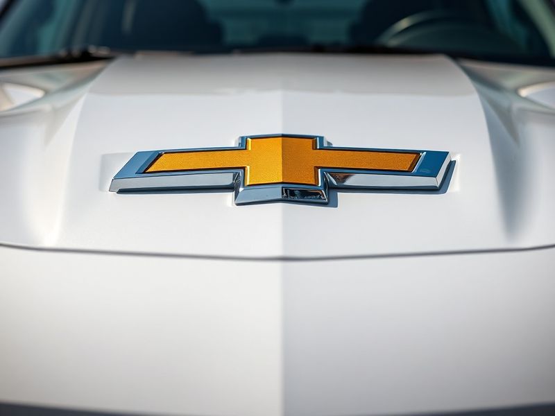
The current Chevrolet logo, introduced in 2021, represents the brand’s commitment to sustainability and innovation. This version features a more minimalist approach with subtle curves and a metallic finish that suggests both tradition and forward-thinking. The emblem now appears across Chevrolet’s diverse lineup, from electric vehicles like the Bolt EV to traditional trucks and SUVs.
Symbolism and Cultural Impact of the Chevrolet Bowtie
The Chevrolet bowtie has transcended its function as a corporate logo to become a cultural symbol. For generations of Americans, the emblem represents reliability, innovation, and the open road. The bowtie’s simple yet distinctive design has made it instantly recognizable worldwide, appearing on vehicles in over 100 countries.
Chevrolet’s logo has been referenced in popular culture through music, film, and literature. From Bruce Springsteen’s “Cadillac Ranch” to countless Hollywood car chase scenes, the bowtie emblem has become shorthand for American automotive culture. This cultural ubiquity has helped cement Chevrolet’s position as an American institution.
The logo’s durability reflects Chevrolet’s ability to adapt while maintaining core brand values. Unlike many corporate symbols that undergo frequent redesigns, the bowtie has remained fundamentally recognizable despite numerous refinements. This consistency has contributed to Chevrolet’s status as one of the world’s most valuable automotive brands.
Global Recognition and Market Position
Chevrolet’s logo plays a crucial role in the brand’s international strategy:
- China: The bowtie is often paired with Chinese characters in local marketing, creating a bridge between global and local branding
- Europe: The emblem maintains its core design but is adapted to local tastes through color variations and styling cues
- South America: The logo often appears with regional design elements that resonate with local consumers
- North America: The bowtie represents both heritage and innovation in the brand’s largest market
Chevrolet’s ability to maintain a consistent visual identity while adapting to local markets demonstrates the logo’s flexibility and enduring appeal.
Future Directions: Electric Vehicles and Digital Branding
As Chevrolet enters the electric vehicle era with models like the Silverado EV and Equinox EV, the logo faces new challenges and opportunities. The brand has already begun experimenting with animated versions of the bowtie for digital platforms, reflecting the growing importance of digital branding in automotive marketing.
The next evolution of the Chevrolet logo may incorporate elements that suggest sustainability and technological innovation. Some industry observers predict the bowtie could evolve to include subtle electric vehicle indicators or environmental messaging while maintaining its essential shape.
Chevrolet’s parent company, General Motors, has committed to an all-electric future by 2035. This transition will likely influence the brand’s visual identity, with the logo potentially incorporating new colors or design elements that reflect electric powertrains and sustainable manufacturing.
Regardless of how the logo evolves, the Chevrolet bowtie’s core strength lies in its simplicity and adaptability. These qualities have allowed it to endure for over a century while remaining relevant to each new generation of consumers.
Conclusion: A Legacy of Design and Enduring Appeal
The Chevrolet logo represents more than just a corporate emblem—it’s a visual shorthand for American automotive history, innovation, and culture. From its 1913 origins to its current digital-friendly design, the bowtie has maintained its essential character while adapting to changing times and technologies.
As Chevrolet continues to evolve with the automotive industry, its logo will undoubtedly continue to serve as a powerful symbol of the brand’s heritage and vision. The bowtie’s enduring appeal demonstrates how effective design can transcend its original purpose to become a cultural touchstone.
For enthusiasts and collectors, the evolution of the Chevrolet logo tells a visual story of American automotive history. Each refinement and redesign reflects broader cultural shifts, technological advancements, and changing consumer expectations. This rich history ensures that the Chevrolet bowtie will remain an important part of automotive culture for generations to come.
Explore more automotive history and design evolution on our Automotive and Culture pages.