
UK Snow Weather Maps: How to Read and Use Them Effectively
The UK’s unpredictable weather patterns often lead to sudden snowfall, disrupting travel and daily life. Weather maps tracking snowfall provide critical insights for commuters, emergency services, and outdoor enthusiasts. Understanding these maps can mean the difference between a smooth journey and being stranded.
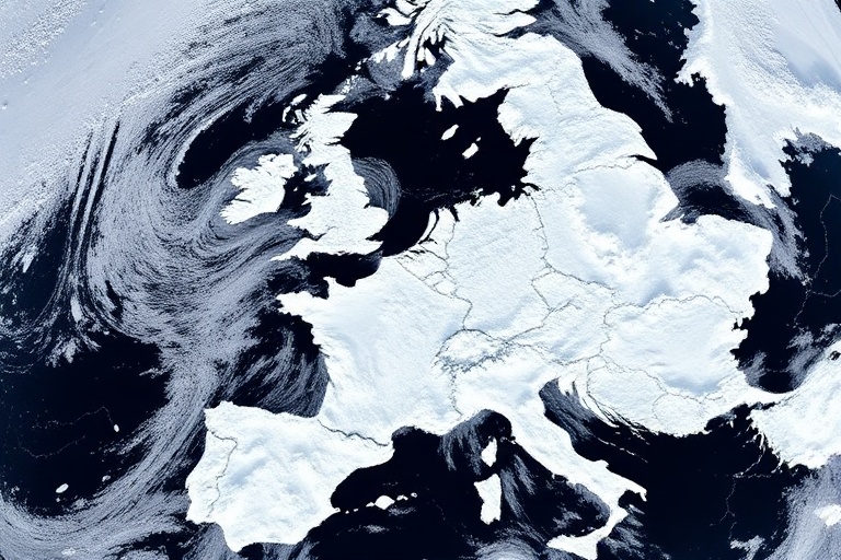
Snow weather maps are more than just colorful visuals. They offer real-time data on snow accumulation, intensity, and timing. With climate change altering traditional weather patterns, these maps have become essential tools for preparedness. Here’s how to interpret them and why they matter.
The Science Behind Snow Weather Maps
Snow weather maps are generated using satellite imagery, radar systems, and ground-based meteorological stations. These tools collect data on temperature, precipitation, and wind patterns to predict snowfall distribution. The Met Office, BBC Weather, and private weather services like Dave’s Locker Weather provide these maps with varying levels of detail.
Key components of snow weather maps include:
- Snowfall intensity: Shown through color gradients, indicating light, moderate, or heavy snow.
- Timing and duration: Predicted start and end times of snowfall events.
- Geographical coverage: Regions most likely to be affected, often highlighted in red or orange.
- Accumulation forecasts: Estimated snow depth in centimeters or inches.
Advanced maps also incorporate real-time updates from weather stations, ensuring accuracy. For instance, the Met Office’s official snow warnings use a tiered system—yellow, amber, and red—to indicate severity. Yellow warnings suggest be prepared, while red warnings demand immediate action.
How to Read a Snow Weather Map
Reading a snow weather map requires familiarity with its symbols and color codes. Most maps use a combination of colors and icons to convey information quickly. Here’s a step-by-step guide:
- Identify the legend: The legend explains the symbols, colors, and terms used on the map. Look for icons representing snowflakes, wind direction, or temperature ranges.
- Check the color scale: Colors like blue, purple, and white typically indicate increasing snowfall intensity. Darker shades often represent heavier snow.
- Look for isobars and fronts: Isobars (lines of equal pressure) and weather fronts help predict where snow bands will form. Cold fronts, for example, often bring sudden snow showers.
- Note the timestamps: Maps are updated frequently. Ensure you’re looking at the most recent data to avoid outdated forecasts.
- Cross-reference with radar imagery: Radar loops show snowfall movement in real time, helping track storms as they develop.
For casual users, apps like Dave’s Locker Tech offer simplified versions of these maps. They provide push notifications for snow warnings in specific areas, making it easier to stay informed without diving into complex data.
Why These Maps Matter Beyond the Forecast
Snow weather maps aren’t just for planning your commute—they have broader implications for infrastructure, agriculture, and public safety. Local governments rely on these maps to deploy gritting teams and salt spreaders, preventing road accidents. Farmers use them to protect livestock from extreme cold, while emergency services prepare for potential power outages or hospital surges.
In urban areas, heavy snow can paralyze public transport, leading to economic losses. The 2018 Beast from the East, for example, cost the UK economy an estimated £1 billion per day. Maps predicting such events allow businesses to adapt, whether by encouraging remote work or adjusting supply chains.
Climate change is complicating these predictions. Warmer global temperatures can lead to more erratic snowfall patterns, with sudden bursts of heavy snow in unexpected regions. This unpredictability makes accurate snow weather maps even more vital for long-term planning.
Tips for Using Snow Weather Maps Effectively
To get the most out of snow weather maps, follow these practical tips:
- Bookmark reliable sources: The Met Office, BBC Weather, and commercial services like AccuWeather provide high-quality maps. Avoid relying on social media for critical updates.
- Check multiple sources: Different services may prioritize different data. Cross-referencing ensures you’re not missing crucial details.
- Plan ahead: If heavy snow is forecast, stock up on essentials like food, water, and medications. Keep a shovel and ice scraper in your car.
- Monitor updates: Snow forecasts can change rapidly. Set alerts on your phone or weather app to receive real-time notifications.
- Understand local risks: Urban areas may face different challenges than rural ones. Cities deal with traffic delays, while rural roads may become impassable.
For outdoor enthusiasts, these maps are indispensable. Ski resorts and hiking trails depend on accurate snow depth forecasts to ensure safety and accessibility. Backcountry skiers, in particular, use specialized maps to assess avalanche risks and plan routes.
Ultimately, snow weather maps are tools for empowerment. They bridge the gap between raw data and actionable insights, helping individuals and communities navigate winter’s challenges. By learning to read and use them effectively, you can stay one step ahead of the snow.
Final Thoughts
The next time you see a snow forecast light up your screen, take a moment to understand what it’s really saying. The colors, symbols, and timestamps are more than just visuals—they’re your guide to staying safe and prepared. As weather patterns grow more unpredictable, these maps will only become more valuable.
Stay informed, stay safe, and let the snow weather maps work for you.