31 Atlas: The World’s Newest Map Is Already Outdated—and That’s the Point
31 Atlas: A Cartographic Joke with No Punchline
By “World-Weary” Watanabe, Dave’s Locker Foreign Desk
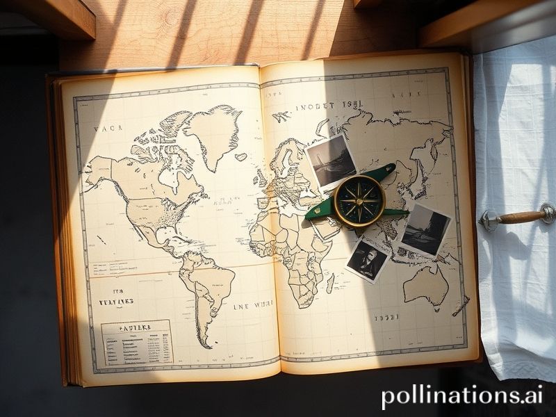
Somewhere between the Sea of Japan and the Sea of Despair lies the 31 Atlas, a new, crowd-sourced map that claims to chart “the world as it actually exists, minus the delusions.” Released last Tuesday by an anonymous collective that insists it’s “neither a start-up nor a cult, but a mood,” the atlas has already been banned in three countries, pirated in 17 others, and cited by two hedge funds as “forward-looking.” All in 72 hours—a pace that makes both TikTok and the fall of Kabul look sluggish.
What, exactly, is the 31 Atlas? On the surface, it’s a digital map stitched from 31 overlapping data layers: satellite imagery, shipping manifests, OFAC sanctions lists, Grindr heat maps, and—because irony is not yet tariffed—UN peacekeeping budgets. The result is a planetary patchwork that colors nations not by GDP, but by “probability of being referred to as ‘the global south’ in a think-tank brunch.” Finland, for instance, appears a cool aquamarine (“stable, but still apologizing”), while Lebanon glows a frantic fuchsia (“stable only in the sense that a Jenga tower is stable until the music stops”).
Naturally, the cartographers are coy about methodology. When pressed, they offered a single line: “We averaged every lie ever told at Davos and shaded accordingly.” It’s the sort of glibness that makes diplomats sweat and data scientists reach for stronger antidepressants.
Global implications? Oh, they’re piling up faster than plastic in the Mariana Trench. Singapore’s sovereign wealth fund has reportedly modeled its next decade on a zoomed-in quadrant labeled “Places Where Regimes Outlast Their Own Constitutions.” Meanwhile, Argentina’s central bank—ever the pioneer in economic dark comedy—has pinned the atlas to the break-room fridge next to a cartoon of itself juggling flaming pesos. The caption reads: “At least we’re not gray.” (Gray is the color for “nations currently negotiating with the IMF while simultaneously blaming it for everything.”)
The United Nations, bless its ossified heart, convened an emergency cartographic caucus. After four hours and at least one fistfight over whether Taiwan gets its own Pantone swatch, the caucus concluded that the atlas is “non-normative, non-consensual, and frankly rather rude.” Translation: They hate it because it’s accurate.
Across the Atlantic, the EU issued a strongly worded statement calling the atlas “a gross oversimplification.” This from the same body that still labels entire Balkan countries “potential candidates,” which is Brussels-speak for “we’ll get back to you sometime after the heat death of the universe.” Washington, ever bipartisan when threatened, filed the atlas under “foreign malign influence” and “gift idea for the in-laws” in the same afternoon.
Yet for all the official pearl-clutching, ordinary citizens are quietly obsessed. In Nairobi, boda-boda drivers now reference “the purple zone” to gauge traffic cop extortion rates. In Warsaw, teenagers use atlas hex codes to rank dating-app profiles by geopolitical stability (“swipe left on anyone from the rust-red belt”). And in Tokyo, salarymen have gamified their daily commutes, awarding themselves points for every district they traverse that still has a functioning pension system. The leaderboard is bleakly hilarious; last week’s winner celebrated by purchasing a single banana.
Of course, the atlas is already obsolete. Overnight, the collective pushed “version 31.1,” which recolored half of Central America after someone remembered to include hurricane data. The changelog was a masterpiece of deadpan: “Fixed bug where hope was incorrectly displayed.” Users responded with the customary memes: a GIF of Sisyphus pushing a server rack up a hill labeled “real-time updates.”
So what does it all mean? In an era when borders shift with the whims of oligarchs and mapmakers alike, the 31 Atlas is less a navigational tool than a mirror. A fun-house mirror, cracked and smeared with our collective fingerprints, but a mirror nonetheless. It tells us what we already know: the world is a mess, beautifully and terrifyingly so, and our most honest cartography may just be the one that admits the terrain is mostly made of spin, debt, and the faint smell of impending doom.
Still, if you squint, there’s a perverse comfort in seeing the absurdity laid bare. After all, if we can map the chaos, perhaps we can laugh at it—right up until the moment the joke maps us back.