Why the USPS Postmark Redesign Has the Internet in a Full-Blown Nostalgia Frenzy
# The USPS Postmark Shake-Up: Why the World’s Suddenly Obsessed with Stamps
In the age of digital communication, where emails and texts zip across the globe in milliseconds, it might seem like the humble postmark has been left in the dust. But hold onto your mailbags, folks, because the United States Postal Service (USPS) has just given the postmark a major glow-up, and the internet is losing its mind over it. Why, you ask? Well, buckle up, because we’re about to dive into the fascinating world of postmarks, cultural nostalgia, and why this seemingly mundane change has become a global trending topic.
## The New Look: What’s All the Fuss About?
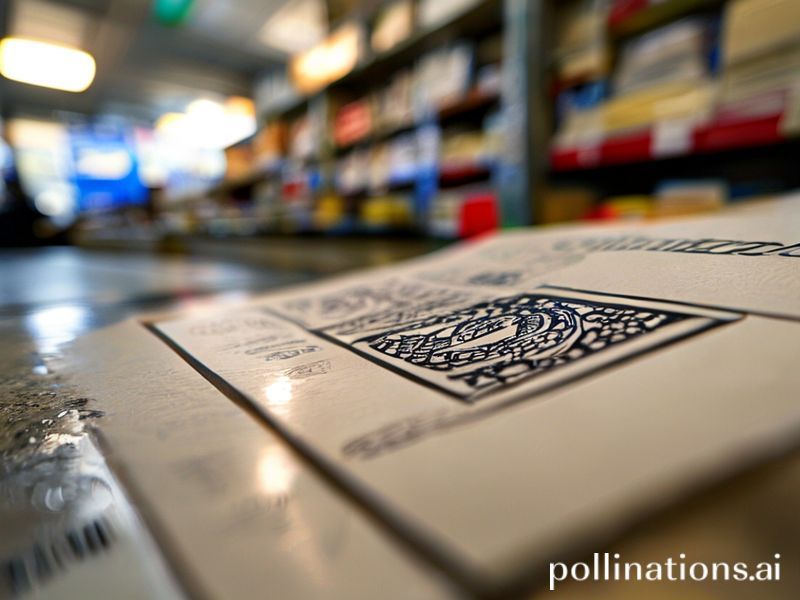
The USPS recently announced a redesign of its postmark, swapping out the old-school typeface for a sleeker, more modern font. The new design also includes a fresh layout and a touch of color. It’s like the postmark got a makeover on *Queer Eye*, and the internet can’t stop gushing about it.
But why is this such a big deal? Well, for starters, the postmark is more than just a stamp of approval on your mail. It’s a tiny, inked time capsule that tells a story. It marks the moment your letter or package entered the vast, mysterious world of the postal system. It’s a tiny piece of proof that your thoughts, your words, your parcels have been officially acknowledged and are on their way to their destination.
## Nostalgia Overload: The Cultural Context
In an era where everything is instant, there’s something undeniably charming about the postmark. It’s a relic of a slower, more deliberate time. It’s a tiny piece of analog in our digital world, and people are obsessed with it.
Think about it: when was the last time you sent a handwritten letter? When was the last time you eagerly awaited a reply, only to be thrilled by the sight of a postmark indicating that your letter had finally reached its destination? For many of us, it’s been a while. But the USPS postmark redesign has brought all those feelings rushing back.
It’s like the internet has collectively experienced a wave of nostalgia, remembering the days when snail mail was the only way to communicate with loved ones far away. And in a world that’s always connected, there’s something comforting about that.
## The Social Impact: Why This Matters
So, why does this matter? Why is the world suddenly obsessed with postmarks? Well, for one thing, it’s a reminder of the power of tangible, physical objects. In a world where everything is digital, there’s something deeply satisfying about holding a piece of mail in your hands, running your fingers over the postmark, and knowing that it’s been on a journey.
But it’s also a reminder of the importance of the postal service itself. The USPS is more than just a way to send letters and packages. It’s a vital part of our infrastructure, a lifeline for small businesses, and a crucial service for millions of people around the world. The postmark redesign is a symbol of the USPS’s commitment to modernizing and adapting to the changing times, and that’s something worth celebrating.
## The Bottom Line: Why This Topic is Significant
So, there you have it. The USPS postmark redesign might seem like a small, insignificant change, but it’s a big deal. It’s a symbol of nostalgia, a reminder of the power of the physical, and a testament to the importance of the postal service. It’s a tiny, inked piece of our cultural history, and the world is finally giving it the attention it deserves.
So, the next time you send a letter or a package, take a moment to appreciate the postmark. It’s more than just a stamp of approval. It’s a tiny piece of art, a symbol of our past, and a reminder of the journey our mail takes to reach its destination. And who knows? Maybe, just maybe, it’ll bring a little bit of joy to your day.
—