Weather Maps: The Internet’s New Obsession and Why You Can’t Stop Staring
**Weather Maps: The New Internet Obsession That’s Got Us All Glued to Our Screens**
Alright, folks, let’s talk about the unexpected star of the internet: weather maps. Yes, you heard it right. Those colorful, swirling, and sometimes downright terrifying graphics that predict if we’re in for a sunny day or an apocalyptic storm. Suddenly, everyone’s a meteorologist, and weather maps are the hottest thing since sliced bread. But why? What’s got us all glued to our screens, refreshing our weather apps like our lives depend on it? Let’s dive in.
**The Cultural Context: From Boring to Binge-Worthy**
Remember when weather reports were just some guy in a suit pointing at a map, saying it might rain? Boring, right? Well, not anymore. Thanks to advancements in technology and data visualization, weather maps have transformed into mesmerizing, real-time works of art. They’re like the internet’s new favorite TV show, but with more wind speeds and less drama (well, maybe not less drama—have you seen the polar vortex lately?).
Social media has played a huge role in this phenomenon. Platforms like Twitter and TikTok have turned weather maps into viral sensations. Who can forget the infamous “bomb cyclone” or the “spaghetti models” that had everyone speculating about the next big storm? It’s like we’re all part of a global weather-watching party, and the maps are the main attraction.
**The Social Impact: More Than Just Rain or Shine**
Weather maps aren’t just about knowing if you should bring an umbrella. They’ve become a vital tool for staying informed and safe. With climate change bringing more extreme weather events, having real-time, accurate information can be a lifesaver—literally.
But it’s not all doom and gloom. Weather maps have also brought people together. They’re a common topic of conversation, a shared experience that transcends borders and cultures. Whether it’s bonding over a heatwave or commiserating about a snowstorm, weather maps have become a social glue in our increasingly digital world.
**Why It’s Significant: The Power of Data Visualization**
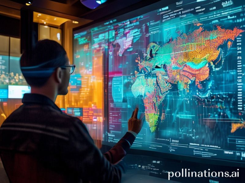
At the heart of this trend is the power of data visualization. Weather maps take complex data and turn it into something beautiful and understandable. They make us feel connected to the world around us, reminding us that we’re all part of the same planet, experiencing the same weather patterns.
Moreover, this trend highlights the importance of science communication. Meteorologists and data scientists are the unsung heroes behind these maps, turning raw data into something that captivates millions. They’re making science accessible and engaging, one weather map at a time.
**Conclusion: The Weather Map Revolution**
So, there you have it. Weather maps are more than just tools for predicting the weather. They’re a cultural phenomenon, a social connector, and a testament to the power of data visualization. They’ve turned us all into weather enthusiasts, glued to our screens, refreshing our apps, and bonding over the latest storm or heatwave.
In a world that often feels divided, weather maps remind us that we’re all in this together. So, the next time you check your weather app, take a moment to appreciate the beauty and significance of those swirling, colorful maps. They’re more than just rain or shine—they’re a shared experience that brings us all together.