
Commander’s New Logo: A Bold Step in Brand Evolution
“`html
Commander’s New Logo: A Visual Shift in Brand Identity
By Jane Holloway | Published
The Evolution of a Brand Mark
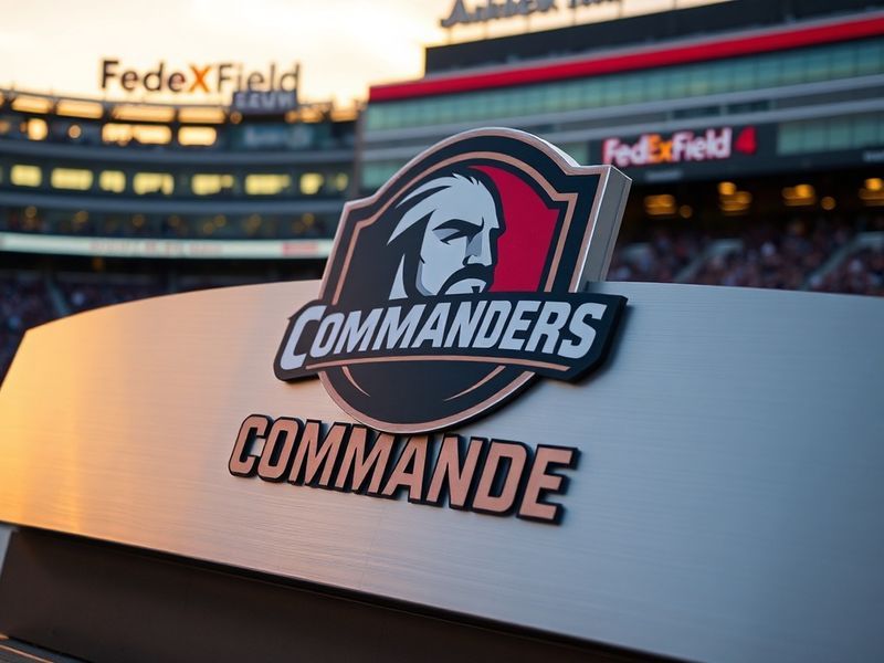
Commander’s recent rebranding initiative marks one of the most deliberate visual transformations in its history. The updated logo, unveiled last month, replaces the bold, serif-heavy emblem that has defined the brand for nearly a decade. In its place stands a sleeker, sans-serif design with softened edges and a bolder color palette. This shift is not merely cosmetic—it signals a broader strategic pivot aimed at modernizing the brand’s image and expanding its appeal to younger audiences.
The previous logo, characterized by its sharp angles and traditional typography, reflected a more established, authoritative tone. The new design, however, leans into minimalism and accessibility. It removes the serifs that once conveyed gravitas, opting instead for a clean, rounded font that feels more approachable. The color scheme has also been refined, with a brighter primary palette that includes a vibrant teal accent—a departure from the muted tones of the past.
Design Choices and Their Meaning
At first glance, the new logo appears deceptively simple. Yet every element has been carefully curated to align with Commander’s evolving brand narrative. The typography, a custom sans-serif font named “Commander Nova,” was designed to balance readability with a sense of dynamism. Its rounded terminals soften the overall appearance, making the logo feel less rigid and more inclusive.
The color palette serves as another key differentiator. The dominant navy blue retains a sense of trust and professionalism, while the teal accent introduces a touch of creativity and forward-thinking energy. This combination is no accident—it reflects Commander’s ambition to merge legacy with innovation. According to a company statement, the teal was chosen for its association with clarity and communication, two pillars of the brand’s new positioning.
Key Design Elements of the New Logo
- Typography: Custom sans-serif font (“Commander Nova”) with rounded terminals for approachability.
- Color Palette: Navy blue for trust, teal accent for creativity and clarity.
- Shape: Softer edges replace sharp angles to convey accessibility and modernity.
- Symbolism: The teal accent subtly nods to digital communication and innovation.
Broader Implications for Brand Strategy
The logo redesign is part of a larger rebranding effort that includes updated packaging, a refreshed website, and a new marketing campaign. This coordinated shift suggests that Commander is positioning itself for growth in competitive markets, particularly in the tech and lifestyle sectors where visual identity plays a crucial role in consumer perception.
One of the most telling aspects of this rebrand is its timing. Commander has historically been associated with traditional industries, but recent expansions into digital services and consumer products have necessitated a more contemporary aesthetic. The new logo acts as a visual bridge between the brand’s heritage and its future ambitions. It signals to existing customers that the company remains reliable, while also appealing to younger, design-conscious consumers who prioritize modernity and inclusivity.
Critics and industry analysts have offered mixed reactions. Some praise the boldness of the redesign, arguing that it successfully modernizes the brand without alienating its core audience. Others question whether the changes go far enough, noting that the teal accent—while distinctive—may not fully differentiate Commander from competitors in crowded markets. Regardless of the debate, the rebranding effort underscores a critical truth about contemporary branding: visual identity is no longer static. It must evolve to stay relevant.
What Comes Next for Commander?
The success of the new logo will ultimately be measured by its reception over time. Will consumers embrace the refreshed identity, or will it feel like an unnecessary departure from the familiar? Early indicators suggest cautious optimism. Social media reactions have been largely positive, with many praising the logo’s clean lines and vibrant colors. However, the true test will come as Commander rolls out the new branding across its physical and digital touchpoints.
For now, the focus remains on consistency. The new logo must be applied uniformly across all platforms, from product packaging to digital interfaces. Any inconsistencies could dilute its impact and confuse consumers. Additionally, Commander will need to invest in comprehensive brand education—both internally and externally—to ensure that the new identity is understood and embraced by all stakeholders.
Looking ahead, the rebranding effort may serve as a case study for other legacy brands seeking to modernize. The balance between heritage and innovation is delicate, but Commander’s approach offers a blueprint. By retaining core brand elements while embracing contemporary design principles, the company has taken a calculated risk that could pay dividends in the long run.
“A logo is not just a symbol—it’s a promise. The new Commander logo reflects not only who we are today but who we aim to become.”