
Chevrolet Logo: A Century of Evolution and Brand Identity
Few symbols in the automotive world carry as much historical weight as the Chevrolet logo. Since its inception in 1913, the iconic “bowtie” emblem has become synonymous with American automotive excellence. More than just a graphical mark, the logo represents innovation, reliability, and a legacy that spans over a century. Its design has undergone subtle refinements, yet the core identity has remained intact, making it one of the most recognizable brand symbols worldwide.
The Origins of the Chevrolet Logo
The story of the Chevrolet logo begins in 1911 when Swiss race car driver and automotive engineer Louis Chevrolet co-founded the Chevrolet Motor Company with William C. Durant. The logo’s creation is often attributed to Durant, who reportedly saw the design on a French hotel wallpaper in 1908 and sketched it on a napkin during a dinner meeting. The original design was a simple, symmetrical bowtie shape enclosed within a circular border, evoking a sense of stability and motion.
The first official use of the logo appeared in 1913, coinciding with the launch of the Chevrolet Series C Classic Six. This model was positioned as a luxury vehicle, and the logo was intended to convey sophistication and quality. Over the years, the emblem evolved alongside the brand, reflecting changes in design philosophy while maintaining its core visual elements. By the 1920s, the bowtie had become a permanent fixture on Chevrolet vehicles, solidifying its place in automotive history.
Key Milestones in Logo Evolution
The Chevrolet logo has seen several iterations, each marking a different era in the company’s history:
- 1913-1920s: The original bowtie design with a clean, unadorned look. The emblem was often accompanied by the word “Chevrolet” in a serif font, emphasizing tradition.
- 1930s-1940s: The logo became more streamlined, with the bowtie taking on a slightly three-dimensional appearance. The circular border was often replaced by a golden hue, symbolizing prestige.
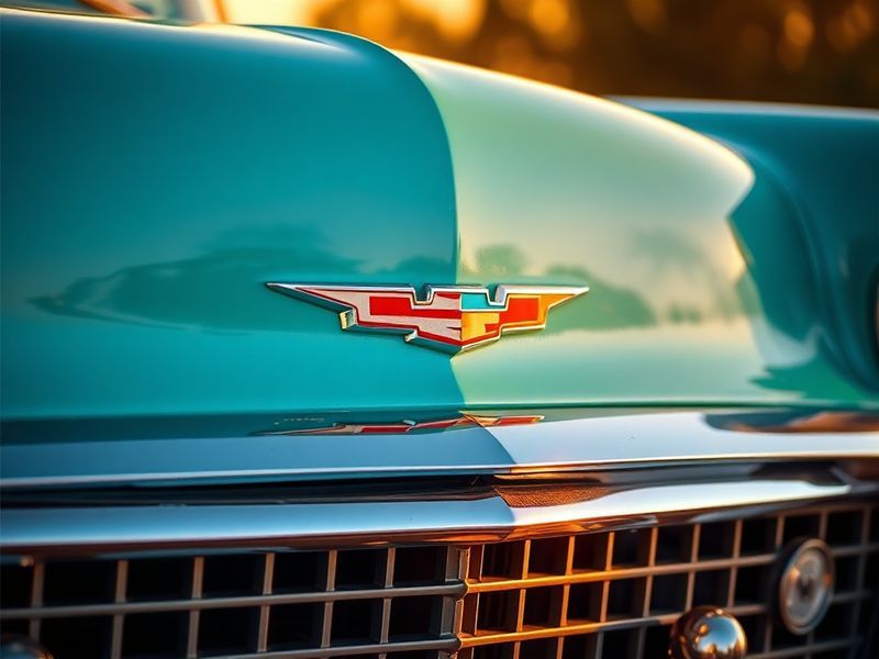
- 1950s-1960s: The “V” in the bowtie was emphasized, creating a more dynamic and modern look. This period coincided with Chevrolet’s dominance in motorsports, particularly NASCAR and drag racing.
- 1970s-1980s: The logo adopted a flatter, more geometric design, reflecting the era’s minimalist aesthetic. The color scheme shifted to a more subdued palette, aligning with the fuel-efficient vehicles of the time.
- 1990s-2000s: The bowtie was modernized with a sleeker, more angular design. The emblem became more versatile, appearing on digital interfaces as Chevrolet expanded into global markets.
- 2010s-Present: The current logo features a refined bowtie with a metallic finish, emphasizing durability and innovation. The wordmark is often presented in a bold, sans-serif font, reinforcing the brand’s contemporary identity.
The Symbolism Behind the Bowtie
The Chevrolet bowtie is more than just a decorative element; it carries layers of symbolism that resonate with the brand’s values. The shape itself is often interpreted as a crossroads, representing the intersection of technology, design, and performance. Some historians suggest that the bowtie’s symmetry mirrors the balance between engineering precision and artistic expression, two pillars of Chevrolet’s philosophy.
The color scheme of the logo has also played a crucial role in its perception. The traditional gold and black combination evokes luxury and exclusivity, while the modern metallic silver reflects innovation and forward-thinking. These colors are not arbitrary; they are carefully chosen to evoke specific emotions and associations in the minds of consumers. For instance, gold often signifies prestige, while silver conveys modernity and efficiency.
“The Chevrolet logo is a visual shorthand for American ingenuity. Its simplicity ensures instant recognition, while its evolution reflects the brand’s ability to adapt without losing its core identity.”
Broader Implications: The Logo’s Role in Branding and Marketing
The Chevrolet logo’s enduring success offers valuable lessons in branding and marketing. Unlike many automotive logos that undergo frequent redesigns, Chevrolet has maintained the bowtie’s essence while allowing it to evolve organically. This approach has fostered a sense of continuity and trust among consumers, who associate the logo with reliability and quality.
In today’s competitive automotive market, brand identity is more critical than ever. The Chevrolet logo serves as a touchstone for the company’s marketing strategies, appearing on everything from vehicles to merchandise. Its versatility allows it to adapt to different mediums, whether it’s emblazoned on a racing car or displayed on a digital advertisement. This adaptability has been crucial in maintaining the logo’s relevance in an era dominated by digital and social media.
Moreover, the logo’s global recognition has made it a powerful tool for Chevrolet’s expansion into international markets. In regions where Chevrolet competes with local brands, the bowtie emblem acts as a unifying symbol of quality and performance. This cultural adaptability is a testament to the logo’s design, which transcends language and geography.
Comparative Analysis: Chevrolet vs. Competitors
When compared to other iconic automotive logos, Chevrolet’s bowtie stands out for its simplicity and timelessness. For example, the Ford logo, with its script font, emphasizes heritage and tradition, while the Toyota logo’s three overlapping ovals represent its global reach and innovation. In contrast, Chevrolet’s bowtie is instantly recognizable regardless of the medium, making it a masterclass in minimalist design.
Another key differentiator is the bowtie’s adaptability. While many logos struggle to remain relevant across generations, Chevrolet’s emblem has seamlessly transitioned from the early 20th century to the digital age. This longevity is a result of careful stewardship by the brand, which has balanced tradition with innovation in its logo design.
Conclusion: A Legacy That Endures
The Chevrolet logo is more than just a symbol; it is a testament to the power of design, tradition, and adaptability. Over the past century, it has evolved alongside the brand, reflecting changes in technology, culture, and consumer preferences. Yet, despite its many iterations, the bowtie has remained a constant, a visual anchor that connects Chevrolet’s past with its future.
As Chevrolet continues to innovate and expand its global footprint, the logo will undoubtedly play a central role in its branding strategy. Its enduring appeal is a reminder that great design transcends time, and that a simple yet powerful emblem can become a cultural icon. For enthusiasts and casual observers alike, the Chevrolet bowtie remains a symbol of American automotive excellence, a legacy that shows no signs of fading.
For those interested in exploring more about automotive history and design, visit Dave’s Locker Automotive and Dave’s Locker Technology sections for in-depth analysis and the latest updates.